So, you’re knee-deep in wedding planning and realize there’s one tricky part you didn’t quite expect — figuring out how to make your entire wedding party look coordinated without turning everyone into walking clones. That’s where this wedding party color coordination guide comes in. Because let’s be real, color can make or break the whole vibe of your day. Whether you’re going for soft romantic tones or bold, show-stopping hues, getting that perfect color harmony across dresses, suits, flowers, and décor is key.
Understanding the Basics of Wedding Color Coordination
Before you start ordering swatches or scrolling through Pinterest boards, let’s talk basics. The first thing to know: your wedding colors set the tone for everything — the mood, the style, and even how your photos turn out. The wedding party color coordination guide starts with your vision.
Think about what kind of wedding you’re planning. Is it a beach celebration with salty breezes and sunshine? A rustic barn with earthy wood tones? Or a chic city rooftop affair with modern metallics? Each setting naturally leans toward certain palettes. For example, soft pastels work wonders for spring garden weddings, while deep burgundy and gold scream autumn elegance.
Choosing a Core Color Palette
Here’s where the fun begins. Your color palette is like the personality of your wedding. You’ll want a main color, a couple of supporting shades, and maybe a pop accent for flair. Don’t overthink it — usually three to four colors are plenty.
The thing is, your wedding party color coordination guide should revolve around balance. If your main shade is bold (like emerald green or royal blue), use neutrals like beige, champagne, or soft gray to balance it out. If you’re into soft tones (like blush or sage), pair them with a rich accent like navy or copper to keep things interesting.
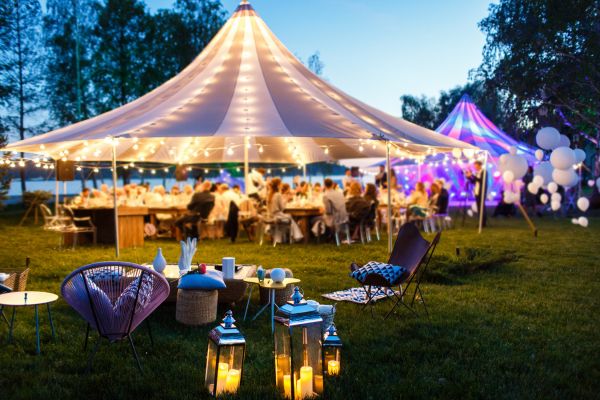
And remember, lighting matters. What looks amazing in daylight might look totally different under twinkle lights at your evening reception. Always test colors in different lighting conditions before you commit.
Coordinating the Bridesmaids
Ah, bridesmaids — the ones who’ll support you emotionally and visually. The days of every bridesmaid wearing the same exact dress are fading fast. Now, mix-and-match styles are where it’s at. Still, even with variety, your colors need to tie together.
Use your wedding party color coordination guide to create cohesion through a shared color family. For instance, if your theme color is dusty blue, one bridesmaid could wear a light shade, another a deeper navy, and another something in between. They’ll all look coordinated but still have individuality.
And here’s a tip most brides overlook — skin tone matters. Some shades look radiant on one person but wash out another. Be flexible. Let your girls choose shades within your palette that flatter them best. The overall result will look effortlessly put together.
Coordinating the Groomsmen
Now, let’s talk about the guys. Coordination doesn’t mean they all have to wear the same suit color. You can play with shades and textures here too. If the groom’s wearing navy, groomsmen might rock lighter blue suits or gray. Or keep the suits uniform and let the ties, pocket squares, or boutonnieres bring in your wedding colors.
For example, if your palette includes blush and sage, the groom could have a sage tie while groomsmen wear blush ties or vice versa. Little details like socks or boutonnieres can tie everything together beautifully without feeling forced.
Mixing Textures and Fabrics
Sometimes it’s not just about the color — it’s about how the color appears. Satin, chiffon, velvet, linen — each fabric reflects light differently, giving your colors dimension and richness. If you want your wedding party to look cohesive but not too “matchy-matchy,” mixing textures can do the trick.
Imagine the bridesmaids in soft chiffon while the groomsmen sport matte linen ties in a similar shade. It’s subtle but makes all the difference. This little trick adds depth, especially in photos, where everything can otherwise blend together.
Considering Seasonal Tones
Your wedding party color coordination guide wouldn’t be complete without talking about the season. Each season brings its own natural palette — and tapping into that can make your color scheme feel more organic.
For spring, think pastel pinks, mint, lilac, or light peach. Summer calls for bright and lively hues like coral, turquoise, or sunflower yellow. Fall is perfect for deep, rich tones like burnt orange, burgundy, and forest green. Winter weddings? They shine with jewel tones like emerald, sapphire, or even metallics like silver and gold.
Aligning your palette with the season makes the whole scene feel intentional — like your wedding belongs in that moment in time.
Coordinating Accessories and Details
Color coordination doesn’t stop at dresses and suits. Accessories, bouquets, shoes, and even hairpieces can all play a role. You don’t need to go overboard — just sprinkle your colors consistently across these small touches.
For instance, bridesmaids could have matching hair ribbons or floral pins in your accent color. Groomsmen can have boutonnières featuring the same flowers as the bridesmaids’ bouquets. It’s those little things that make everything look connected without screaming “color coordination overload.”
How to Keep It Authentic and Not Forced
Here’s the thing — a perfectly coordinated wedding can sometimes feel a little too… perfect. You want harmony, not uniformity. Let personalities shine through. If your maid of honor feels most confident in a different neckline or your best man insists on sneakers, roll with it. Those quirks make your day real and memorable.
Use your wedding party color coordination guide as a framework, not a rulebook. It’s there to help create visual balance, but ultimately, your wedding should reflect you and your partner’s personalities.
Final Thoughts: Bringing It All Together
When it comes down to it, the best wedding party color coordination guide is the one that feels true to your style. Think of your colors as the soundtrack of your wedding — they set the emotional tone, highlight your favorite details, and tie everything together.
So, take your time choosing. Play with samples, trust your instincts, and don’t stress about perfection. Weddings are about love, laughter, and all those imperfectly perfect moments. When your wedding party looks good and feels comfortable, that confidence shines through in every photo, every dance, every smile.
And honestly? That’s what color coordination is really about — bringing together all the people you love in a way that looks as beautiful as it feels.