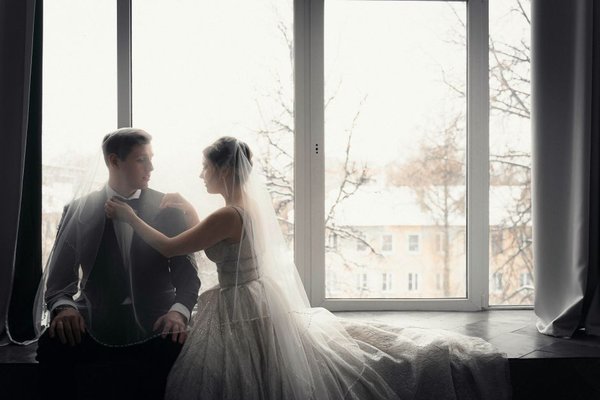
A winter wedding has a natural sense of occasion: earlier sunsets, candlelit rooms, sculptural branches, and fabrics that feel at home in cooler weather. The best winter wedding color palettes work with those details rather than relying on snowflakes or holiday decorations. Think of color as a conversation between the venue, the lighting, and the textures guests will see up close.
There is no single correct set of winter wedding colors. A glasshouse celebration might call for pale blue and silver, while a historic hotel could look wonderful in burgundy and antique gold. These combinations offer a starting point, along with ways to carry each palette through flowers, stationery, attire, and seasonal wedding decor.
Winter Wedding Color Palettes Worth Considering
Ivory, Champagne, and Soft Gold
For an elegant wedding palette that feels warm without looking festive, layer ivory linens, champagne-colored details, and restrained gold accents. Cream roses, taper candles, and subtly textured napkins give the scheme depth. Choose one gold finish, such as brushed brass, for candlesticks and table numbers; mixing too many shiny finishes can make the room feel busy.
Emerald Green, Forest Green, and Antique Brass
Deep greens bring the outdoors into a winter setting without requiring a Christmas theme. Use forest green for substantial elements such as bridesmaid dresses or table runners, then introduce brighter emerald sparingly through glassware or printed details. Antique brass softens the darker colors. Evergreen foliage can help, but ask your florist to balance it with flowers or branches so every arrangement does not resemble a holiday wreath.
Burgundy, Dusty Rose, and Pewter
Burgundy gives winter celebrations richness, while dusty rose keeps the result romantic rather than heavy. Pewter-colored accents offer a cooler alternative to gold. Picture burgundy dahlias where seasonally available, muted rose-colored blooms, and gray linen napkins against an ivory tablecloth. Flower availability varies by location and growing season, so ask your florist to match the color story rather than promise a particular bloom.
Midnight Blue, Slate, and Silver
Midnight blue and slate capture the drama of an evening reception. Silver adds light, especially around mirrors, glassware, and candleholders. This is one of the most versatile metallic wedding colors combinations for a formal ballroom, but the dark tones need contrast. Keep menus and place cards light enough to read, and add pale flowers or cream candles to prevent the tables from disappearing into a dimly lit room.
Ice Blue, Pearl White, and Soft Gray
An icy scheme can look sophisticated when it feels tactile rather than frosty. Pair pale blue stationery or dresses with white florals, dove-gray linens, and pearl-like accents. Avoid making every surface metallic: matte paper, wool-inspired textiles, and frosted glass provide a quieter counterpoint. In a venue with cool daylight, this palette looks crisp; under warm bulbs, test the blue beforehand to make sure it does not read as green.
Plum, Mauve, and Copper
Plum is a wonderful alternative to predictable red winter flowers. Mauve lifts the deeper shade, and copper adds warmth without the brightness of yellow gold. A plum velvet ribbon around bouquets, mauve-toned flowers, and copper table details can create a layered, intimate atmosphere. Keep copper to a few repeated elements so it looks deliberate. This combination is particularly lovely against dark wood or exposed brick.
Espresso Brown, Oatmeal, and Cream
For a modern, understated winter celebration, try espresso, oatmeal, and cream. Brown velvet seating accents, natural linen, ceramic vessels, and cream flowers give the scheme a comfortable, collected feel. It suits restaurants, country houses, and minimalist spaces where bright jewel tones may compete with the architecture. Add candlelight and perhaps a subtle bronze detail; without varying texture, neutrals can look flat in photographs.
How to Choose the Right Palette for Your Venue
Start with what you cannot change. A venue with red carpets, amber lighting, and patterned wallpaper already has a visual personality. Ivory and champagne may blend beautifully, while icy blue could clash. Conversely, a bright modern gallery offers a clean backdrop for midnight blue or emerald.
Gather fabric, paper, and flower references and view them together in the actual room if possible. Look once in daylight and again under the lighting planned for dinner. Winter ceremonies may begin in afternoon light and end after sunset, so the same swatch can appear surprisingly different across the event.
As a practical example, imagine a December ceremony in a wood-paneled hotel with a 5 p.m. reception. Forest green runners, ivory centerpieces, and antique brass candleholders will likely feel warmer and more integrated than an all-silver arrangement. Sample one table setting before ordering every runner or charger. A photograph taken with the venue lights on can reveal whether the greens are too dark.
Carry the Colors Through Without Matching Everything
Choose one main color, one supporting neutral, and one accent. Let the dominant shade appear on larger surfaces such as linens or attire, then repeat the accent in smaller details. Florals should interpret the palette, not replicate every shade exactly.
Texture matters especially in winter. Velvet, satin, matte ceramics, handmade-feel paper, clear glass, and metal reflect light differently, which makes a limited palette interesting. If you need ideas for building tables with fewer decorative pieces, explore winter wedding centerpiece ideas. For the broader room, candlelit wedding reception decor can help connect tables, entrance arrangements, and seating areas.
Check practical constraints too. Metallic foil printing may cost more than standard ink; large quantities of specialty flowers can increase budgets; and some venues restrict open flames. LED candles, textured ribbons, and thoughtful lighting can deliver much of the atmosphere without depending on expensive or restricted elements. Coordinating seasonal wedding flowers with your florist early allows room for sensible substitutions.
Frequently Asked Questions
What are the most elegant winter wedding colors?
Ivory with champagne and gold, midnight blue with silver, and forest green with antique brass are strong choices for an elegant winter celebration. The most successful option is the one that complements your venue and looks good under its lighting.
Can a winter wedding use light or pastel colors?
Absolutely. Ice blue, blush, soft gray, and pearl white can feel distinctly wintry when paired with deeper accents or rich textures. Pale colors do not have to look like spring if the materials and setting reflect the season.
Should metallic accents be gold or silver?
Use the room as a guide. Gold and brass often flatter warm interiors, while silver and pewter suit cooler schemes. Either can work with jewel tones. Repeating one main metal finish usually feels more intentional than mixing several competing finishes.
How many colors should a winter wedding palette include?
Three core colors are a manageable starting point: a dominant shade, a neutral, and an accent. Florals and natural materials can introduce subtle variations without becoming additional formal palette colors. Test combinations in real lighting before committing.
A Winter Palette That Feels Like Yours
The strongest winter wedding color palettes do more than photograph beautifully on a mood board. They feel right in the room, remain readable and inviting after dark, and leave space for the textures that make cooler-season celebrations special. Choose colors you genuinely love, edit the metallic details, and let lighting and materials create the atmosphere.